Search
Sign Up Like Talk English Search our artists, events, and merchandise. Subscribe to our email newsletter for:
• the latest news 
info@gallerynucleus.com
(626) 458-7482 (626) 458-7477 12pm to 8pm 12pm to 10pm 12pm to 8pm 210 East Main St. Alhambra, CA 91801  Blogs 01/07/2015 Blogs 01/07/2015

Events
About
Zombie in Love Raffle + Costume Details
Aug 31, 2011 posted by: Alexis
We're just 3 days away from the Zombie in Love opening reception! Please note: only those who show up in costume (zombie AND/OR prom attire) on Saturday will be entered into a special hourly raffle giveaway! Get into it, zombies and prom-goers—we want to see you all in your best dressed! 8 PM Zombie Fair shirt
Zombie in Love Reading & Drawing Demo with Scott C!
Aug 30, 2011 posted by: Alexis
Opening night also includes free door prizes for the first 25 attendees, hourly raffle prizes for those who arrive in zombie and/or prom attire, a free photo booth op with Mortimer and friends, as well as zombie-inspired refreshments for everyone to enjoy.
An Interview With Scott C.
Aug 27, 2011 posted by: Nucleus
Meet Scott C.!
It is true! Pop culture is a big influence on my paintings. I am inspired by nostalgia and making fun of the things that have influenced my life since childhood. Well, maybe it's not making fun really. Or, maybe it is. We're laughing together, pop culture and I. I like to feel good and make people happy. Oftentimes people are pretty happy when they recognize things and discover things. I like to create paintings that give people those moments.
I've worked in video games for about 10 years or so, creating concept art and storyboards for Double Fine Productions. The biggest projects were probably Psychonauts and Brutal Legend. Working on those titles taught me about backstory and meaning behind the way things look and how environments and characters themselves can tell a story. While working at Double Fine, I made comics and watercolor paintings for galleries and made visits to comic conventions. Video games, comics, and galleries were all very different venues for creating stories and they all fueled my creativity differently. Each made an impact upon the other. Children's books are a rather new medium for me, but it's one that I have been excited about exploring since I was young. Kids create the craziest stories, so it is fun to try to think in that realm. The one media I would love to explore is film and also live performance...and puppets. I would like to try all three of those things actually.
It took me awhile to find comfort in my painting medium. I tried acrylic and gouache, but they all felt too dense for me. Watercolors have an awesome airiness to them that makes me feel super good. I like getting the texture and looseness as well. My style is pretty janky with a shaky line because I like imperfection. There is more character in a weird effed-up line than in a perfect line, I feel. I'd like to get into more textures actually, like collage. I've always wanted to go back and try oils again though, which was my absolute favorite long ago. 
I have always been fascinated by children's art and stories. I wonder where the heck they get these crazy ideas from. They create insane scenarios that adults struggle to come up with. I used to work with kids an awful lot and I enjoyed listening to their stories as they painted. I would like to think that some of that energy has crept into the narratives that I create in my paintings.
The most enjoyable reaction I could get from someone observing my paintings is laughter, a little pointing, and even smiling. I could go with smiling just fine. I realized a while ago that that was what was most important to me when people experience my artwork. But I don't like to shovel it out to everyone. I like to lay out a few little things and make them subtle so that they can piece it together themselves. Other times, they are obviously just overly preposterous. That's how it goes.
The idea for Zombie In Love came from my editor at Simon & Schuster, Namrata Tripathi. Kelly wrote a super funny story with really descriptive notes and ideas on jokes. Most of the illustration process was coming up with visual gags with Namrata and Sonia Chaghatzbanian, the art director, to enhance the story. They were all amazingly clever people, so the process was very enjoyable. It's incredibly satisfying to make each other laugh when you all respect each other's tastes. So that's how it went, and I enjoyed the process very much. 
Mortimer had to be a lovable dude. But he also had to be a zombie. Zombies are terrifying and gross usually, so we had to make him pleasant enough for kids to want him to succeed in finding someone special. I wanted to make him look sort of optimistic and eager, so that you don't get too sad when he is failing all the time. And we had rules for the goriness as well. We could have body parts fall off, but it had to almost look like a doll. And no messed up skin. I tried having worms coming out of his skin, but it was decided that that was going too far. So we kept him blueish. People turn blue when they die, I think I read somewhere.
Well, I have his plaid shirt for sure.
Yeah, man. Keep trying over and over again and go to any dance titled "Cupid's Ball" and if you hear someone fall down and make a crashing sound behind you, turn around! It may be that super special someone, but if it's not, that's ok, too. 
Big puppy dog eyes, a pleasant smile, rubbery arms to hold, and a soft shirt. Those are some ingredients, but you can mix and match.
I do have an art book coming out! it is called Amazing Everything. Insight Editions is putting it out and Jack Black did a special little foreword for it. It compiles many of my paintings in the past few years from various shows including some things from Home Slice and Great Great Grand Show at Gallery Nucleus. Just a bunch of things. It will be hard bound and largeish and it'll sit nicely on coffee tables or people's laps.
I've got a variety of little group shows going on. Some book things are in the works. The Great Showdowns are still happening. Summer is still happening. Fall is almost here. All kinds of things!
How to Slay a Dragon: An Interview with Justin Gerard
Aug 25, 2011 posted by: Nucleus
For his latest exhibition with Nucleus, Justin Gerard honed his illustrative talents to recreate his own vision of St. George and the Dragon. Aptly titled, St. George and the Dragon, the show consists of seven fantasy-driven pieces, a combination of pencil, ink, and watercolor drawings, each capturing a passage within the story. Justin is no stranger to this kind of content—his portfolio displays a diverse eclecticism of monsters and magic having done fantasy concept art for Warner Bros. and Insomniac Games. We were fortunate enough to catch up with Justin and ask him a few questions about his Gallery Nucleus Show. Here are some of his thoughts on the St. George tale, his re-visioning, and his creative process. "I have always enjoyed the St. George legend and have contemplated doing a short series on it for some time. Some of my interest in it is in the simple, straight-forward enjoyment I get out of man vs. monster themed works. And knight vs. dragon is perhaps the most archetypical variation of this theme in Western culture.
When asked about the particularity of the scenes he had chosen to illustrate, Justin remarked that they were a product of heavy rumination and meditation and that they best reflected his own feelings at time. He also added, "Like other illustrators of the fantasy genre, I just really like drawing dragons." Who's to argue with that one?
Justin also spoke with uncertainty on how "St. George and the Dragon" would fit into his large catalogue of work, even hinting that this re-envisioning was only just the beginning of what he hoped to explore. "Possibly it will find a common thread with the rest of my work because the man vs. monster or man vs. impossible circumstances themed works have existed and will likely always exist in my work. I suppose also that the limitations of my own abilities and the technical peculiarities of my own methods of working will likely brand these as creations of mine. But I am not really sure how they will fit in. I feel like I am still just sort of getting started with everything. There is so much more I want to explore, so many other stories I want to tackle that I am not certain how these pieces will fit in." And as for the actually creative process? From the sounds of it, it's very meticulous and thoughtful, often requiring the piece to undergo many transformations before actually arriving to its finished state. "Generally it involves a lot of conceptual work in pencil and then more conceptual work in digital. I spend a lot of time early on trying to separate good ideas from bad ideas. (Or at least that is the plan...) After this I will do a very tight drawing to size. Then I will transfer that drawing to bristol board and watercolor the piece. For some of these I will often take that watercolor and then work digitally over that to further refine it. I have an idea in my head, often from the very first thumbnail I did of a scene, and sometimes I can achieve the colors and ideas in my head with just watercolor, and sometimes I can't. When I can't seem to get it through watercolor I almost always finish the painting digitally. I hate not being able to really capture what's in my head. It's sort of like waking from a really amazing dream and remembering that it was amazing but not being able to remember anything about it."
Lastly, we asked Justin about any recent sources of inspirations and how these may have aided him in his creative efforts. "I took a backpacking trip along the John Muir trail recently, and like most backcountry trips, it was very inspiring. I tend to spend most of the earlier parts of these trips hating hiking, camping, people, traveling, switch-backs, and mosquitos. But by the end I end up loving life and people again. And I tend to come back with a much better perspective on everything afterwards. Getting out and away from everything does a lot for me. The John Muir trail is an amazing place for reflection, meditation and inspiration. And also to get eaten by mosquitos if you go at the wrong time of year." So if you haven't already, be sure to come by Nucleus and check out Justin's St. George and the Dragon and be on the look out for his upcoming piece in Nucleus's October show, Breath of Embers.
Allegorical Mythos: An Interview with Jeremy Enecio
Aug 09, 2011 posted by: Nucleus
The work of Jeremy Enecio reveals not just a young master who commands his media with precision and passion, but an artist who knows how to convey strong haunting atmospheres laced with symbolism and curiosity. For his latest Nucleus exhibition, "Embodiments," Jeremy uses these strengths to explore his recent fascination with nymph mythology. But rather than recreating the image of the nymph, Jeremy uses the nymph as a foundation, a fertile base in which his own ideas can expand and grow. In a short interview, Jeremy was kind enough to illuminate the processes behind his work, shedding light upon the nymphs, their meaning, and the significance of their recontextualization. Here are his thoughts on the nymphs and the fascination behind them.
When asked about the nymphs and the man-made constructs, Jeremy revealed that this juxtaposition was meant as a way to explore his own understanding of modern concepts. Taking these ideas and appropriating them to paint has allowed him to turn the tangible into things of visual substance. "I like to think of nymphs as not having any one true form, yet they reveal themselves in particular ways. In most traditional cases they are human females. I took this a little bit further using spirits, perceived visually, to represent not only objects, but concepts. They act as icons, or proxies to otherwise invisible things. Nymphs are also bound to their environment, perhaps because they are their environment. This idea plays a key role in this series in that the figures only represent part of what makes up the nymph. They are not isolated from the elements surrounding them. In “Poverty,” the two figures in the distant background, indifferent yet capable of judgement, are an extention of the central figure as an embodiment of that particular experience. Most of us rarely look at the world we live in without being bogged down by societal influences. We see beauty the way we were taught to see it. We use technology and can’t imagine life without it. I wanted to convey these ideas in a timeless way. The idea of the nymph is an ancient one, and using it to illustrate modern ideas forces the viewer out of their own modern perception of things." As for the dark and brooding aesthetic quality to his work, Jeremy spoke of these decisions as being intuitive and without the intentionality of being creepy or haunting. "I think as an aesthetic, it has always been subconscious in my work. Often times, I don’t even see a piece as being dark, whereas someone else would find it utterly creepy. Although most of the pieces in this show are admittedly somewhat dark, the concepts I’ve chosen to illustrate are not altogether negative. Technology, for instance, is by no means a bane on humanity, but I’ve represented it as a figure in struggle, awkwardly attempting to balance on artificiality, and with multiple eyes to view the world simultaneously, there is a sense of bewilderment. I think images that bring negative issues to light have a bigger impact on me and stick with me more intensely than an image without any tension."
"I started off with notes, jotting down ideas of what I wanted to see embodied in human form. After I narrowed down the ideas into a group I was happy with, I focused on symbolism, trying to incorporate certain motifs and personal symbols into the sketches. This is a challenge because it’s important for me to pull from my own vocabulary of meanings and keep away from universal symbolism. The finished pieces are a mixture of acrylic and oil. I am constantly experimenting with different techniques which is why there are so many variations of paint application in this series. That’s the fun part for me. I painted all of the pieces sort of simultaneously, keeping a close watch on how they all fit together. At several intervals, placing them all side by side to make sure they felt like one body of work while at the same time, having a good variety of color schemes." When asked about the future of his work and what direction it would take, Jeremy seemed uncertain, but seemed quite pleased with how things were turning out, stating that he was enjoying the direction in his subject matter.
Raffle Contest Tonight!
Aug 06, 2011 posted by: Nucleus
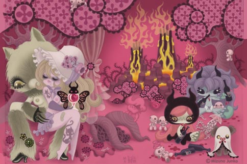
We are excited about tonight's opening for many reasons including a fun raffle contest where Junko Mizuno fans can take home some really special items. All attendees will each receive 1 free raffle ticket and additional ones are available for $1 each. At least three prizes will be awarded at 8pm, 9pm, and 10pm.

Exclusive Junko Cinderalla Shirt
Aug 05, 2011 posted by: Nucleus
We've got a brand new Junko Mizuno exclusive graphic t-shirt coming your way! They're coming hot off the press and will available for this Saturday's show. Pick one up while you can!
Don't Miss Rick O'Brien's, A Wolf in the Fold!
Aug 04, 2011 posted by: Nucleus
Alongside our three other exhibitions to be featured this Saturday, will be Rick O'Brien's gallery installation, A Wolf in the Fold. This piece impacts beyond the visual level, embodying the elements of ambition and struggle as means to conceptual convey O'Brien's interest in human fraility and fortitude. Curious? Take a look at these teaser pics.
Five New Junko Prints Availabe for FREE with a Purchase of a "Cinderalla" Original
Aug 04, 2011 posted by: Nucleus
Junko Mizuno on her Art, Cinderalla, and More!
Aug 02, 2011 posted by: Nucleus
Japanese artist, Junko Mizuno, has a very distinguishable style—her works, renowned for their vibrant colors and luscious figures and a fascination with the macabre, have garnered much deserved attention and acclaim. Her latest show with Nucleus will showcase her earlier illustrations from her book, Cinderalla. Skimming through these pieces, it’s difficult to absorb them without a piqued curiosity—the drawings are so imaginative and surreal, so vivid and captivating, one can’t help but wonder what it may all mean. Luckily, Junko was nice enough to answer some of these pressing issues. “I really don't have anything I want to convey in my art. I make art for my pleasure and feel very lucky that I can make a living on it. I wonder why some people seem to notice only cuteness and grotesqueness in my work. My art is a reflection of myself and it has a lot of elements in it just like I do. Not only just cuteness and grotesqueness. I grew up enjoying "cute" Japanese stuff, I also enjoy some B-horror movies, I like silly Japanese comedy shows, I love food etc. etc... and they are all in my art! It's just natural that I'm influenced by many different things. I've never tried to mix only cuteness and grotesqueness into art just to shock people.” “I just love drawing women and I feel liberated when I depict them as energetic and feisty. But I'm not trying to send out messages by my work at all. My art is basically very personal. The female characters in my work might be my ideal self, but it's not that I'm saying all women should be like them.” “There's no logic to them at all! They are just my fantasies so you don't need to take them too seriously. I just want people to enjoy them however they want. I know they may have meanings if psychologically analyzed, but I don't feel the need to do it. I want to stay spontaneous. If I think too much, my work gets boring!” The remainder of the interview focused on Cinderalla, how such project came into fruition and what inspired Junko to add her own twists to the classic fairy tale.
Nucleus Featured In BRINK Magazine
Aug 01, 2011 posted by: Nucleus
Orlando's BRINK Magazine has kindly featured us in their August/September issue. BRINK focuses on art and pop culture and covers a wide range of topics ranging from fashion and film to music and spirituality. Check out what BRINK has to offer and be sure to read up on Nucleus! Our Other BlogsNew Photos
2025 | Power In Numbers 
2025 | GOKURAKU-Paradise: Group Show with Katsuya Terrada, Junko Mizuno & Rockin’ JellyBean 
2025 | The Art of Arcane ArchiveJanuary 2015October 2014 May 2014 February 2014 November 2013 October 2013 May 2013 October 2012 September 2012 August 2012 June 2012 May 2012 April 2012 March 2012 February 2012 January 2012 December 2011 November 2011 October 2011 September 2011 August 2011 July 2011 June 2011 May 2011 April 2011 March 2011 February 2011 January 2011 December 2010 November 2010 October 2010 September 2010 August 2010 July 2010 June 2010 May 2010 April 2010 March 2010 February 2010 January 2010 December 2009 November 2009 October 2009 September 2009 August 2009 July 2009 June 2009 May 2009 April 2009 March 2009 February 2009 January 2009 December 2008 November 2008 October 2008 September 2008 August 2008 July 2008 June 2008 May 2008 Advertisers |